
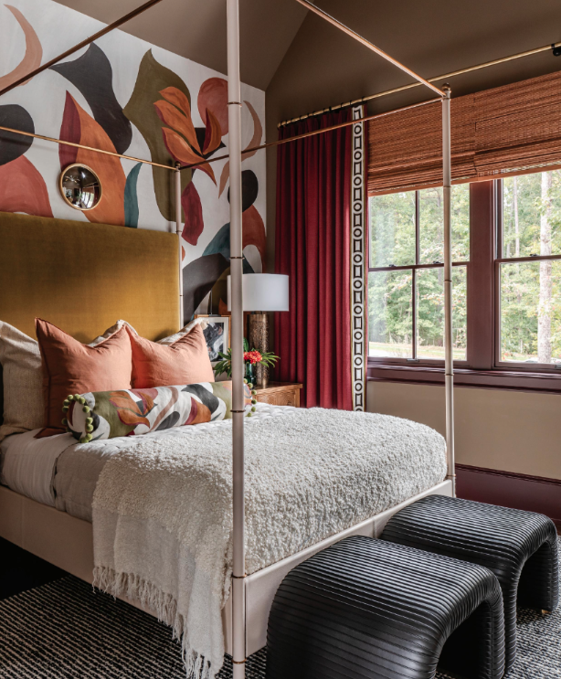
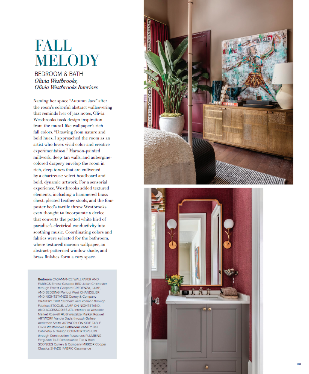
![Cover[1]-v2.jpg](https://images.squarespace-cdn.com/content/v1/60b94089e5e67e4712570abf/e82f65ae-f29b-4951-a993-03d166acde32/Cover%5B1%5D-v2.jpg)
![OLIVIA WESTBROOK Interiors Vol 4 2024[2]-v2.jpg](https://images.squarespace-cdn.com/content/v1/60b94089e5e67e4712570abf/3adf87d1-48b1-4637-85fc-a864504aeb41/OLIVIA+WESTBROOK+Interiors+Vol+4+2024%5B2%5D-v2.jpg)

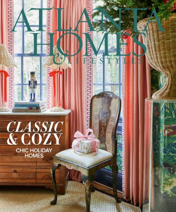
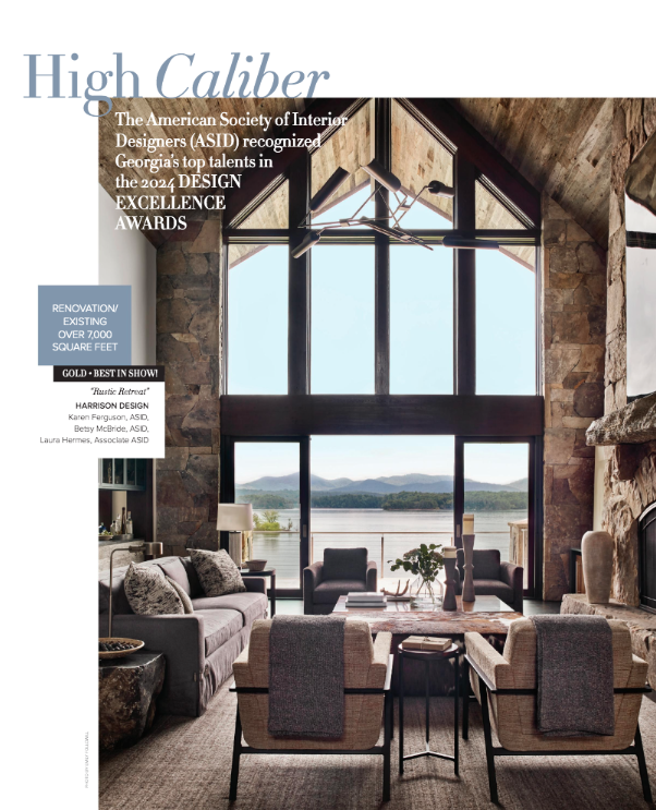
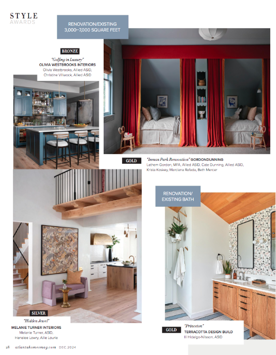
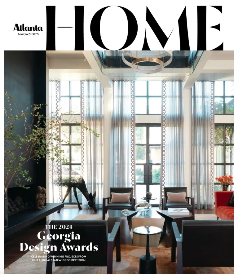
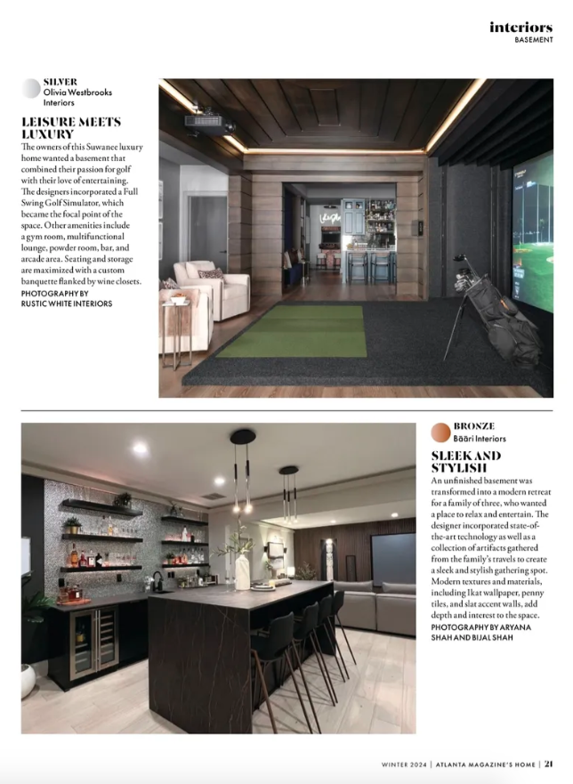
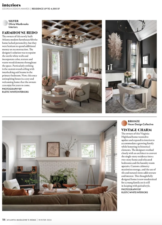


Coffered Ceiling 101: A Guide to the Elegant Home Feature
What rooms work best with a coffered ceiling?
“I like including coffered ceilings in living rooms and bedrooms,” says Olivia Westbrooks of Olivia Westbrooks Interiors in Atlanta. “We often focus on walls and floors in these spaces, but you spend a lot of time looking up in the bedroom and living room while resting, and coffered ceilings are a great way to add intrigue to another canvas.” Read more…
58 Incredible Bathroom Remodel Ideas That Prove Anything Is Possible
These before-and-after photos will inspire your next project.
To infuse a sense of fun and whimsy into the home, Westbrooks adorned the walls of this powder room with bold floral wallpaper, complemented by black floor tiles. The fixtures are elegantly outfitted in stunning brass, creating a modern space that boasts both an edgy touch and abundant warmth.
At the annual To Live & Dine event presented by Modern Luxury and ADAC, nine of the Southeast’s top interior designers showcased incredible originality and creativity with tables inspired by the Sherwin-Williams 2025 Color Capsules.
This space, themed “Disco in the Garden,” showcases hot pink walls, disco ball accents, and butterfly artwork honoring Westbrooks’ mom’s spirit. She designed it to embody everything she loves, creating a fun and imaginative atmosphere. Westbrooks’ intention is that it brings joy to those who experience it.
25 Bedroom Décor Ideas for a Space You'll Never Want to Leave
We asked interior designers to share their best bedroom décor tips and tricks.
Blush is a neutral color that still feels warm and welcoming. "Blush is a soothing and sophisticated, grounding color for any age and pairs well with warm neutral," says interior designer Olivia Westbrooks. "Use blush as an accent in the drapery, pillows, and art." To round out the color scheme, she suggests adding pops of gold or brass via hardware, lighting, and accessories.
Negative space is the secret to a nicer looking home
In home design, the space around your objects matters as much as the objects themselves.
To avoid visual overload, choose a focal point in each room — a fireplace, work of art, dramatic staircase, piece of furniture — and remove distracting elements around it. That’s the approach Atlanta designer Olivia Westbrooks took when designing a home office. To highlight an eight-foot-tall artwork, she kept the walls around it bare, allowing the piece to pop.
Community Highlights: Meet Olivia Westbrooks of Olivia Westbrooks Interiors
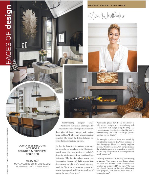
My story begins in Lafayette, Louisiana. As a young girl creativity came naturally to me. I would spend my days after school sketching and crafting. I remember my elementary school teacher always recruiting me to help her with creative projects. She actually had me paint the Statue of St. Mary in the school courtyard to bring it to life with color! My dad was a painter and wallpaper installer, so I was exposed to that part of the design trade at a very young age. I loved watching art shows on TV, such as Pappyland and my absolute favorite, The Joy of Painting with Bob Ross. As a teenager, I stumbled across The Christopher Lowell Show and was introduced to the world of design. He was an animated interior decorator who made magic, transforming boring rooms into fabulous havens in a matter of minutes. One of my favorite things to do as a child was rearrange the furniture in our home and decorate each space with my own personal touch. When I discovered this could be a career, I fell in love with the idea of becoming an Interior Designer. After graduating high school, I enrolled in the Interior Design program at Louisiana State University. I received my formal training and Bachelor’s Degree in Interior Design, then moved to Atlanta shortly after college graduation and began my career. Read More…
THE 43RD ANNUAL ASID DESIGN EXCELLENCE AWARD
Olivia Westbrooks Interiors is the Recipient of the 2024 Design Excellence Award for the River Club Basement Project
The Georgia Chapter of the American Society of Interior Design gathered at the Stave Room on May 23rd, 2024 to celebrate the best of interior design amongst residential, commercial, healthcare and hospitality designers at the 42nd Annual Design Excellence Awards. Hosted by Ronnel Blackmon, the evening honored more than 30 design firms for their project excellence.
15 of 32 — Blue Gray Bedroom
Go dark and moody! A deeper shade of gray is ideal for those who are inclined to use dark blue but want something a bit off the beaten path. Boldly contrast it with earthy tones like this stunning terracotta hue.
20 of 32 — Accent-Filled Gray Bedroom
There are so many ways to creatively use gray in the bedroom beyond just on the walls: shop gray throws, pillows, mirrors, and so much more.
10 Renovation Mistakes You're Most Likely to Regret, According to Design Pros
Rushing Your Purchases
A successful renovation is all about playing the long game, and sometimes that means holding off on big purchases, despite sales or a holiday bonus burning a hole in your pocket. “One big mistake I’ve seen homeowners make when it comes to renovating their home is purchasing furniture without a design plan,” says Olivia Westbrooks of Olivia Westbrooks Interiors. “It’s so important to have a sense of proportion and a flushed-out design concept before making any big purchases. I’ve had clients buy pieces without a floor plan or a furniture layout drawn up, which can leave them with pieces that are too large or too small for their spaces.”
Not Swatching Your Paint Picks
As anyone who has ever tried to find the perfect white paint for their space before knows, not all shades are created equally. What looks great in a friend’s home or under the lights of your local hardware store can appear drastically different on your walls, which is why it's so important to swatch your paint picks in your home (preferably in multiple spots) before deciding on a shade. “People tend to think picking a paint color is easy, but it’s not as simple as people may think,” says Westbrooks. “There may be 50 different shades of black and they all have different undertones, which can also be impacted by the lighting in the room. Clients may want a true black, but if they pick a black with a green undertone, it will cast a green shade when the light hits the paint on the wall. It’s our job as interior designers to know the ins and outs of paint colors and how they will work in a space.”
How To Make Your Bedroom Feel Bigger, According To Designers
Stick To A Monotone Color Palette
To ensure that your bedroom appears more sizable, you won't want to integrate all sorts of different colors into the space, says Olivia Westbrooks, the founder of Olivia Westbrooks Interiors in Atlanta, Georgia. “Creating a sense of visual openness in a room becomes achievable by sticking to a specific palette of tones, whether it's darker or lighter hues,” she explains. When designing smaller bedrooms, Westbrooks will often paint the walls, trim, and even ceiling all one hue and then select furniture and fabrics that draw from a cohesive tonal family.
Allow For Additional Space
To ensure that a bedroom doesn’t appear too cramped, allow for two feet of walking space around the bed, Harrison urges. You will also want to create space by allowing for visible open area underneath furniture. “Lifting the furniture off the floor tricks the eye into perceiving more space, ultimately making the room seem larger,” Westbrooks explains, adding that therefore, furniture on legs—particularly thin ones—is your best bet
5 ways to create a maximalist color palette – embrace a celebration of jewel tones for this more-is-more style
Maximalism is an interior design style that embraces excess and drama, and that's no less true when it comes to color. Celebrating the richest of hues, a maximalist color palette is eccentric, loud, and full of personality.
'Maximalist decor in interior design is all about giving the viewer lots to look at,' explains interior designer Olivia Westbrooks of Olivia Westbrooks Interiors. 'Pattern play and an overload of vibrant stimulating colors are the foundation of maximalism.'
The color wheel can be a useful tool when designing a maximalist color palette. More specifically, choosing those that sit opposite each other on the color wheel, better known as complementary colors, will create a vibrant and playful look.
'Combining complementary colors such as blue and orange achieves a maximalist aesthetic because together they enhance each other’s vibrational quality,' explains Olivia Westbrooks.
What are the most timeless colors in interior design? 6 ways to create a color scheme that never dates
If you're looking for a darker color idea that feels timeless, navy blue is recommended by designers. 'A favorite of mine is navy blue, which is a color that can be both formal and relaxed,' explains Cinzia Moretti. 'It pairs well with a wide range of colors and materials.'
'Blues are popular amongst my design clients because of their restful, calming quality,' adds Olivia Westbrooks, founder and principal designer at Olivia Westbrooks Interiors. 'You can’t get more classic than navy blue. Colors like Benjamin Moore's Hale Navy or Sherwin-Williams' Naval are great options to incorporate into a classic design. Use it on cabinetry, paint, and in fabrics for ultimate impact.'
'I would have to say that white is one of the most timeless colors,' says Olivia Westbrooks. 'I’ve seen browns, greens, and grays come and go, but white has stood the test of time. It has shifted in tone throughout the years. In the early 2000s, creamy white with warm undertones like Sherwin Williams Navajo White was popular. Then the crispness of bright whites like Sherwin Williams Pure White took over with the advent of the modern farmhouse trend.'


